
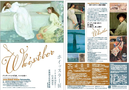
One of the great things about Kyoto is that not only it is a beautiful city full of ancient temples and cultural treasures, it attracts also great people and great things from around the world. Professor S came to Kyoto last week for an international conference organized by EFEO and I took the opportunity to meet the great scholar. Professor S is a well-known scholar of Buddhist archeology and literature in South and Southeast Asia, currently based in Bangkok. At first, I thought I would propose to visit some temples with the professor. Instead he came up with the idea to visit together the Whistler exhibition at MOMAK, the National Museum of Modern Art, Kyoto.
There are so many interesting exhibitions going on in the Kansai region and frankly I just cannot keep up with all of them. But I am really glad that Professor S made this suggestion as otherwise I would have missed this great show!
James McNeill Whistler (1834-1903), the Boston-born painter based in London was known for his subtle yet evocative style, influenced by a number of styles, from classical works, symbolism, impressionism and — “Japonism” which was the highlight of the show. The exhibition was divided into three main parts: portraits, landscapes and Japonism. Although the best known work of Whistler, “Arrangement in Grey and Black No.1” (1871), commonly known as “Whistler’s Mother” was not shown in this exhibition, most of his other well-known works were, including the “No.2”. Overall, the presentation was excellent and the notes (mostly in Japanese) were quite informative, presenting his entire career with many anecdotes, including scandals (Ruskin trial and the scandalous Peacock Room) which I didn’t learn in my art history class.
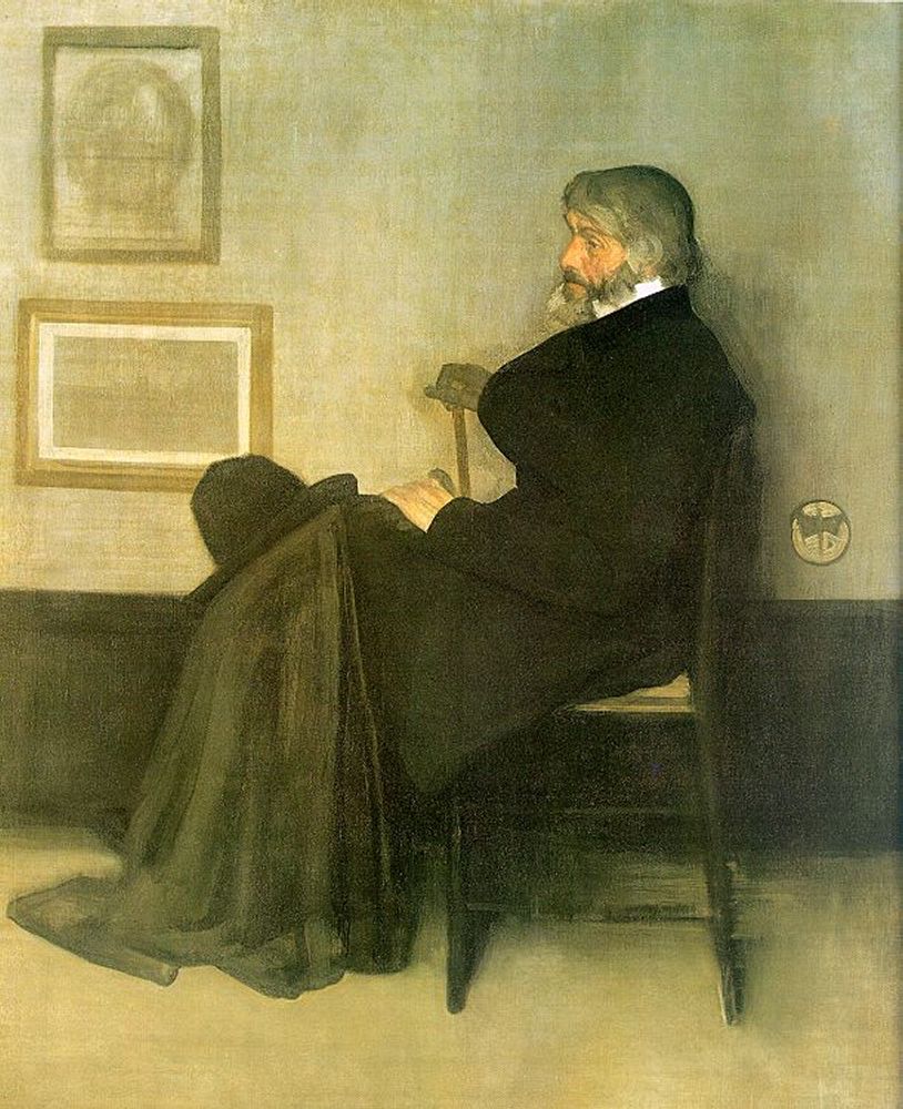
Arrangement in Gray and Black No.2 (1873)
Whistler’s portraits somehow have the ability to connect with the viewers although the artist himself was adamant in his refusal to layer moral messages or other meanings to the art itself. That is why we find all these prosaic titles such as “Arrangement in XXX”, which needless to say, was provocatively didactic in its time. Some of the titles are nonetheless extremely evocative, with musical titles such as “Nocturne” and “Symphony in white”. Particularly striking to me was the pairing of colors such as “Grey and Pearl”, “Brown and Silver”, “Blue and Gold”, “Purple and Rose” and so on. Of course Kandinsky’s Über das Geistige in der Kunst (1912) (“On the Spiritual in Art”) came to my mind concerning the theories of colors. Kandinsky highlighted the synesthetic experience of colors and color combinations as noted from Cezanne’s fruit portraits to a Beethoven’s listening to a Mozart symphony. The colorful “modes à transposition limitée” Messiaen, my favorite twentieth century composer, also came to my mind. When I studied some years ago through the eight “Préludes pour piano” (1930) with Lillian Ayre of Montreal and Prof. Otani Masakazu of Kyoto, that was my perpetual question. Did Messiaen really see these colors? Purple mode? Green with milky white and speckles of gold? Boulez in an interview once said that Messiaen didn’t really see them but just imagined them as a philosopher would. Personally, I did have the experience of hearing colors in my head. Most people see colors and sometimes hear sound in their dreams after all. So perception of colors and sounds does not depend on physical objects. Whistler’s choice of color combination had the same effect on me, although looking at some of the works themselves turned out to be somewhat of an anticlimax.
Beside the great portraits, I was pleasantly surprised by all the lithographs and delicate pen-and-ink works. His choice of subject-matter can be intriguing. Bridges, market, dockyard. Most of the time messy places were not tidied up, but rather, presented in a unpretentious but nonetheless artistic way. I made quite a few notes on the details on paper and printing techniques, which of course mattered a great deal to Whistler. Wove paper, transferred lithograph, lithotint and so on.
As for the Japonism of Whistler which the curator tried to highlight, I was not so convinced. Yes, there was the World Exhibition. Yes, everyone loved Hokusai. For me, however, Whistler has a very distinct style of his own which tends to absorb everything around him. It is quite striking that certain “Greco-Japanese” elements were detected by art historians in his works. Well, undeniably the exoticism of oriental art played a stimulating role in the artworks at that time. But just like hearing a pentatonic passage in Ravel or Debussy, it would be rather far-fetch to claim any direct influence of Chinese music on their work. It is more the inspiration or even imagination of the artists. So the resemblance could be superficial and the impact of “Orientalism” should be considered against the backdrop of the fin-de-siècle Zeitgeist of late nineteenth century. An example would be a work titled “Purple and Rose: The Lange Leizen of the Six Marks” (1864). What are the six marks? Those are the six Chinese characters on the bottom of the vase “大清康熙年製”. I don’t see them anywhere in the painting. Anyone? But that does not matter after all. Whistler was interested in abstract composition with real subject matter, an interesting artistic vision shared by for example the Chinese artist Wu Guanzhong almost a century later. The six characters which translate basically to “made in China” (literally, “made in the years of Kangxi of the Great Qing [Empire]”) carried little meanings to the Chinese other than what it means “made in China”. But to the non-Chinese, the exotic writing is an object of endless fascination. Leibnitz, John Wilkins and others had fantastic idea about the Chinese writing, most of which turned out to be wrong, for example, Chinese characters being logical ideograms instead of logograms as they mostly are. As always, errors can nonetheless be very inspiring.
")
Purple and Rose: The Lange Leizen of the Six Marks (1864)
Thoroughly satisfied, Prof. S and I had lunch at the posh gallery café. The freshly made seafood pasta was lovely (Prof. S chose tofu-fettuccine!) and so were the hors d’oeuvre with fig and macha ice cream. We shared some news about our fellow Canadian colleagues, admittedly not much. I got many second-hand booking-hunting tips for my upcoming trip to Paris and I will definitely try the pastries at Dalloyau when I pass by Les Jardins de Luxembourg! Prof. S informed me also about his current works on the Indian stupas and his rather special interests in Meiji Buddhist artworks. Upon learning Prof. S’s interest in cosmology, before we parted, I thought I would leave him my latest edition of the last chapter of the Yavanajātaka. He asked me to autograph it in English and Sanskrit, which I happily complied. While waiting for me to fetch the copy from my office, Prof. S picked up a few books from the museum bookstore and wrote a poem. He later showed me his poem and asked me if I could guess which painting he was referring to. The poem has a very subdued tone but very evocative at many levels which I thought suited Whistler’s aesthetics very well. The title of his poem gave it away though as it carried the word “Brittany”. I told him that the girl at the lower left corner struck me as rather odd as if she was there only for nothing other than compositional purpose. “L’art pour l’art” exemplified?
 (1861)")
Coast of Brittany (Alone With the Tide) (1861)
We could have spent a few more hours talking about art and Buddhism. But a following lecture cut our meeting short.